Color in landscape design is a crucial element that influences the perception of space, creates atmosphere, and supports harmony with nature. At Ecolandscape Studio, we always approach the selection of color palettes with various factors in mind, from climate conditions to the emotional impact of each garden element. In this blog, we share the basic principles of integrating color into landscape design, as well as practical recommendations to help create harmonious and functional green spaces.
Theoretical Foundations of Using Color in Landscape Design
Color is the foundation of any landscape design. A well-chosen palette enhances the garden’s appearance and affects the perception of space and mood. Color can be used to visually expand or narrow a territory, highlight certain areas, or create contrasting accents.
At Ecolandscape Studio, we always rely on classical color theory, which includes three primary colors: red, blue, and yellow. These are the base shades from which all other colors are derived. It’s important to understand how colors interact with each other. For example, using complementary colors like red and green or blue and orange helps create vibrant contrasts that attract attention and emphasize important elements in the landscape.
Also, keep in mind that colors change depending on the lighting. Bright shades like yellow and orange become more intense under bright sunlight, while deep shades of blue and purple become more expressive in the shade. It’s essential that the color palette aligns with the lighting characteristics of your garden at different times of the day.
How Color Affects the Perception of Space: Tips from Ecolandscape Studio
At Ecolandscape Studio, we always consider climatic and seasonal factors when selecting a color palette. For cold regions, warm shades like red, orange, and yellow are recommended to create visual warmth and coziness in the garden. In southern areas, on the other hand, cooler colors such as blue and green are better to evoke a sense of coolness and freshness.
It’s also important to consider how color affects the perception of space. If you want to create a space that visually expands, use light shades like pastels. For more compact zones, opt for richer colors to prevent them from «getting lost» in large spaces.
According to Martin Palma, founder and CEO of Ecolandscape Studio, “Color in landscape design plays a huge role in creating a unique atmosphere and sense of coziness. We always take into account not only the appearance of plants but also how their shades interact with natural light and surroundings to create harmony and comfort for the garden owners.”
Color Palette for Different Seasons: From Ecolandscape Studio
Seasonality is another key aspect we consider when creating color solutions for landscapes. In spring, accents can be placed on soft pastel shades like pink, lavender, and light blue. These colors create a sense of lightness and freshness, perfect for the start of a new season.
The summer months require more vibrant, saturated colors like red, orange, and yellow. These shades emphasize the brightness and dynamism of nature during this period. In the fall, at Ecolandscape Studio, we recommend focusing on golden, orange, and red tones, which create a warm and cozy atmosphere. In winter, when most of the garden plants are dormant, it’s better to focus on textures and forms rather than colors.
Our designers always strive to use color transitions effectively, so the garden remains beautiful both in cold and warm seasons. For example, plants with bright colors can be placed in certain areas to create visual accents, while other parts of the garden will be filled with calm, neutral shades.
The Psychology of Color in Landscape Design: Tips from Ecolandscape Studio
Color has a strong psychological impact on people, and we at Ecolandscape Studio always consider this aspect when designing gardens. For instance, blue and light blue create an atmosphere of calm and relaxation. These colors are associated with natural elements like water and the sky, making them ideal for rest and meditation areas.
Green symbolizes nature and harmony. This color has a calming effect and helps restore energy, creating a feeling of freshness and space. It’s important to use green as the primary background color and combine it with other shades to create interesting contrasts.
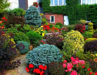
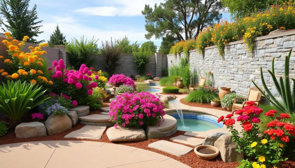
Red and orange energize the space, creating an atmosphere of vitality and joy. Combined with bright sunlight, these colors add dynamism and become visual accents in the garden. To create striking accents, these colors can be used in decorative elements, flower beds, or as a backdrop to other plants.
Purple and violet are associated with luxury and mystery, making them ideal for creating secluded corners in the garden, where one can enjoy peace and quiet.
Integrating color into landscape design is an essential element of creating a harmonious and functional space. At Ecolandscape Studio, we always strive to create spaces that will please the eye and meet the emotional needs of the owners. A carefully chosen color palette can transform the appearance of a garden and increase the comfort of your green corner.